


Blog 7: Color Coordination
Blog 7: Color Coordination
Color Coordination Practice Example
Get the little tutorial book listed at the bottom of this blog. It is one of the most helpful tools that you could have to navigate any website and make the most important and useful decisions that you need to make for all your color co-ordinations on FAA.
On this practice exercise, use what you have already learned in the previous chapters to practice using the Slider (i.e., to manage image and text) … and the Color Wheel to play with border colors.
Here is the website again that you need to guide you through this dynamic process. Go to this website and follow along … and you will see immediately why most people miss out when they go internet shopping.
Click here: https://mitchell-watrous.pixels.com
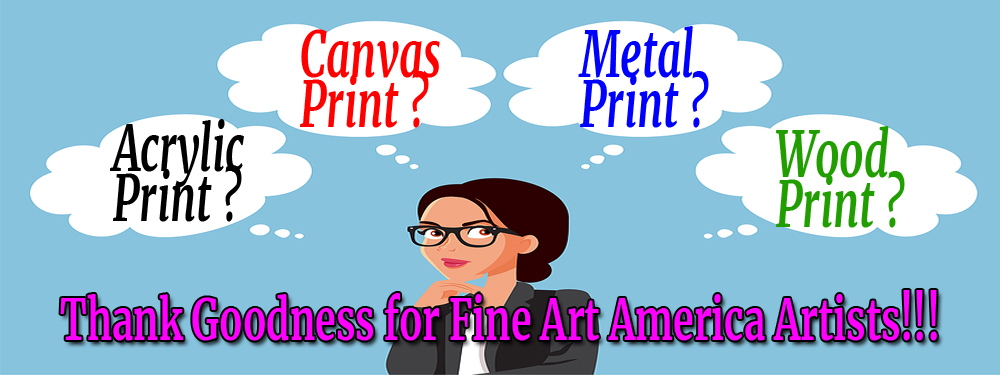
C O L O R Is the Part of All Your Products That Will Make Them or Break Them.
TOOLS: Image Size (Slider) and Color-Wheel + Shade-Tint-Tone Box
I added this part for my customers to practice color strategies on: Fine Art America Products with my website at https://mitchell-watrous.pixels.com … (and on any other websites of FAA Artists).
These steps and techniques will allow you to make many color combinations that most people never even think about.
Who knows, in addition to FAA websites, you might even be able to use these strategies on other websites.
You may already be familiar with these “quick” steps to reach the color options for a product represented on our FAA website (i.e., Click > means to “Left-click” the next action, or link, word, or phrase in the steps below):
-
- Click > https://mitchell-watrous.pixels.com to get started.
- Hover > SHOP … Slide > Mouse Pointer down to Throw Pillows (Home Décor)
- Click > Throw Pillows [ Under Home Decor ]
- Click link > Birthday Cards – Age Related (note: very tiny print)
- Click pillow image > BigStock – 25000286 (I Love You … on throw pillow)
- Click > anywhere inside the SIZE box … then choose size you want (change as desired)
- Click > anywhere inside the PILLOW INSERT box … choose Yes or No.
- Click and Hold > (IMAGE SIZE) Bar while sliding it left or right to choose desired image size on the Throw Pillow. Release the slider bar to see what the image looks like. Practice with the text (i.e., to include or exclude it with the Slider Bar). Change it if necessary.
- Click > (located at far-right side of BACKGROUND COLOR
-
- Note1: If your image covers the entire Throw Pillow … the BACKGROUND COLOR Box will NOT appear. Click & Hold Left Mouse Button > Move the SLIDER BAR to the left until a border appears … then release the Left Click Mouse button and the BACKGROUND COLOR Box will appear. THEN, Click > anywhere inside the BACKGROUND COLOR Box … and the Color Patches will appear.
- Note2: Make your Throw Pillow Border big … so that you can play with it and see the colors better … because you can always increase or decrease the border size to suit yourself.
-
- Click > any color patch from color palette … OR …
- Click > “Show More Colors” link for other options. Note: If you choose a color with the “Show More Colors” option, any previous “Background Color” patch chosen in the previous step will be ignored.
- Now … we can play with the Throw Pillow border colors as previously learned in Blog 6 (Super … Color Wheel Tips) … Remember … like this:
-
- Click > Center of Shade-Tint-Tone Box (and leave the little o right there in the middle).
- Click & Hold > Left Mouse button on the Color Circle … and move round and round on the circle … and watch the color changes on the product’s border!
- Click > Anywhere on Color Circle (and leave the little o right there on the Circle).
- Click & Hold > Left Mouse button anywhere inside the Shade-Tint-Tone Box … and move round and round in the Box … and watch the color changes on the product’s border!
-
- Now … If you wish to return to the “Color Patches” to choose one of those colors … Click > “Show Basic Colors” link … otherwise, continue with the instructions below.
- The safe, first thing you should do to start is to click Inside the Shade-Tint-Tone Box to place the little o in the middle of box. [ Note: If the little o inside the Shade-Tint-Tone Box is located on the top, bottom, or right vertical lines … no color changes will show up regardless of where the little o is placed in the Color Circle. ]
- The second thing is to click on the Color Wheel to choose a color. Clicking anywhere on the Color Wheel … will move the little o location on the Color Wheel to show the color spot chosen … and that color will show up in four places : on the Product, the Background Color Patch, RBG color values, and the Hex Color Code Box value.
- Click (or Tap) > any place inside the Color-Box to adjust color shade or tint (Note: main function of the Color-Box is to adjust the shade or tint … so, pay attention to where you place the little o inside the color box.
- Click > the little square color patch inside-left of the BACKGROUND COLOR box to confirm color choice.
OK, what can you do if you look at the color application on the Throw Pillow (or any other object) … and all you say is, “Yuk, I don’t like that”?
First of all, you will probably notice that your “Color Wheel + Shade-Tine-Tone Box” is gone … because you left that function
You decide that the previous box with all the color patches were better than what you could do for yourself … but you don’t see your little display of color patches anymore either.
You click around in that BACKGROUND COLOR box … but that “Color-Wheel + Shade-Tint-Tone” box that you were recently working with … that darn thing just keeps on popping up … but that is not what you want.
I know … I’ve done this myself. But, there is a quick solution if you only know where to look.
Look just below the “Color Wheel + Shade-Tint-Tone Box” and you will see a little, teeny, tiny, link that says: “Show Basic Colors” … CLICK IT … and you will be back to the place you want to be.
By the way, if you were working with the “Color Wheel + Shade-Tint-Tone Box” … but you did not like anything you were doing … and you did not know how to get back to your previous “Color Patch” box … look down beneath the “Color Wheel/Color Box” option and you will see a little, teeny, tiny, link that says: “Show Basic Colors” … CLICK IT … and you will be back to the place you want to be.
OK … let’s say that you were still not satisfied with the “color patch” choices either. You can actually go back and forth between the “Color Patches” and the “Color Wheel + Shade-Tint-Tone Box” until you get it like you want it
You can still go right back to the “Color Wheel + Shade-Tint-Tone Box” choice again just by clicking on the link you used before: Click > “Show More Colors” and it will be back to you.
If you still are not satisfied with the colors, you can click on the “Show Basic Colors” link again … and do this until you are satisfied … because you cannot break it.
Note #1: You want to be satisfied with your color choices on any of your products … and you want to be able to manage the most important aspect of your purchase … THE COLORS YOU WANT!
If you cannot get close to a color choice you want … because you cannot maneuver the Color-Wheel + Shade-Tint-Tone Box to find a suitable color for you … here is the best solution below.
Click on this resource ColorHexa (link: https://www.colorhexa.com/color-names ) and scroll through 700+ colors with the Hex color codes. Then, what can you do if you find a color you like … but it’s not just quite right yet?
Here is a suggestion and solution to solve your problem:
-
- Find a color with a Hex code close to what you want ( i.e., Bittersweet with Hex code: #fe6f5e )
- Go back to the product page and pull up the Color-Wheel + Shade-Tint-Tone Box
- TYPE the Hex code #fe6f5e into the box (i.e., copy & paste does not seem to activate it).
- If that is the color you want, Click > Patch in the BACKGROUND COLOR box to keep it.
- If you decide it’s not quite right yet, Click > anywhere inside the Background Color Box.
- The Color-Wheel + Shade-Tint-Tone Box will reappear so that you can continue experimenting.
- Do NOT click on the little o in the Color-Wheel … because that keeps your basic color in place.
- If you like the Bittersweet color … you can play around with shades, tints, and tones of it in the “Box.”
- You can get your original Bittersweet color back by just re-typing #fe6f5e back into the Hex code box.
Additional Information for you:
Even though you might not want the largest Throw Pillow size … I suggest that you start working with that size so that you can see all of the options you might have.
If you want a Horizontal or Vertical Throw Pillow Size (which you can choose), you will have to choose the non-square size of 20” x 14” … because all the other sizes are square.
If you start working on a larger Throw Pillow Size like 26’ x 26” … but later you want 14” x 14” … you might discover that the border has disappeared when you click the smaller size. What can you do about that?
Do you have to start all over? NO. Just go to the Slider Bar on the IMAGE SIZE … and slide it to the left until your border reappears. You should still have the same border color you already like still selected.
In the next chapter I will review many of these processes again so that learning can be reinforced.
Later on, I will take the process all the way through to actually ordering a product … and I will use one of the most requested products on the internet as the example … Coffee Mugs!
How can you get the book? Once again … here is the information:
| https://www.amazon.com/dp/B0BTFRP4P3 | [$4.97] eBook |
| https://www.amazon.com/dp/0981862845 | [$11.97] Print Book |
The print book is also very good … and many people prefer to have a print book in addition to an eBook.